Accenture Data Analytics Virtual Internship: (Analyzing Data for Social Buzz)
Recently, I participated in Accenture’s Data Analytics Virtual Internship Experience. Let me walk you through the data analytics project that I completed for a client called Social Buzz, on behalf of Accenture.
Client background:
Social Buzz is a social media and content creation startup that needs to quickly adapt to its increasing business scale.
Social Buzz emphasizes content by keeping all users anonymous, only tracking user reactions to every piece of content.
There are over 100 ways that users can react to content, spanning beyond the traditional reactions of likes, dislikes, and comments. This ensures that trending content, as opposed to individual users, is at the forefront of user feeds.
Over the past 5 years, Social Buzz has reached over 500 million active users each month. They have scaled quicker than anticipated and need the help of an advisory firm to oversee their scaling process effectively.
Accenture has embarked on a three months proof of concept for Social Buzz to address the following needs:
- An audit of their big data practice
- Recommendations for a successful IPO
- An analysis of their content categories that highlight the top 5 categories with the largest aggregate popularity
The Problem
Due to the rapid growth and digital nature of Social Buzz’s core product, the amount of data that they create, collect, and must analyze is huge.
Every day over 100,000 pieces of content, ranging from text, images, videos, and GIFs are posted.
All of this data is highly unstructured and requires extremely sophisticated and expensive technology to manage and maintain.
Social Buzz expects my team to deliver an analysis of their content categories that highlight the top 5 categories with the largest aggregate popularity
The Analytics team
My team consists of three professionals:
Andrew Fleming: The Chief Technology Architect
Marcus Rompton: The senior principal
Stella Justin (Myself): The Data Analyst
As a data analyst, it was my primary responsibility to deliver the hands-on data analytics solution for Social Buzz and to translate the requirements of the project into insight.
Some Business Questions
1. Identify the top 5 content categories with the largest aggregate popularity
2. How many unique categories are there?
3. How many reactions are there to the most popular category?
4. What was the month with the most posts?
5. What content type received the most positive reactions?
Applications and Software used:
1. Microsoft Excel: The Modern Excel capabilities such as Power Query Editor and Power Pivot were used to clean, merge and model the data.
2. Microsoft PowerBI: This was used to analyze and visualize the data in a very insightful way, meeting and surpassing client’s expectations.
3. Microsoft PowerPoint: PowerPoint slides were used to prepare the presentation of my process and findings to Social Buzz.
The Process
- Choosing the right data sets to be used for the project

Social Buzz provided a variety of data tables from their database. Out of these, I selected the above three (3) datasets to be used in carrying out the POC. They also shared their table schema with my team, this gave me a better understanding of all tables and guided my choice of the three tables above for the project.
2. Getting Data from the 3 CSV files into Excel
To achieve an effective and easy transformation of the data, I decided to load the three datasets from CSV files into the Power Query editor in Excel.
The exhibit below shows how the data was accessed from Excel and loaded into the Power Query Editor for transformation.

3. Cleaning and Transforming Data with Power Query Editor
Data cleaning in Power Query editor is one of the beautiful gifts of Microsoft Excel to Modern Excel Analysts.
At this stage, I was able to transform the tables into the format that would be most suitable for modelling and visualization.

Here are some of the changes I made to the tables:
- Renamed the DateTime, Content Type, and Reaction Type fields
- Removed unwanted fields
- Changed data types appropriately across all tables and fields
- I used first row as header where necessary
- I also used the Replace value function to replace all duplicates in the category column, without losing data. The values in the category field had lots of duplicates because some values were entered in both capital and small letters.
4. Modelling Data with Power Pivot
Data modelling is the process of building relationships between data tables.
The aim of data modelling is to create interaction between the tables to enable one look up values or fields from all tables without necessarily stressing over the traditional look-up formulas.

Modern Excel provides the data modelling functionality in Power Pivot that enables one create and manage relationships between tables.
Notice that a many-to-one relationship cardinality exists between the Reactions table and the Content table. The same relationship cardinality also exists between the Reactions and ReactionTypes table as shown in the exhibit above.
5. Merging Tables/Queries
Social Buzz had indicated that they require a single file that comprises the three datasets above cleaned and joined together.
To meet up with this requirement, I employed the Merge Query function in Microsoft Excel to merge the three tables together based on their common fields.
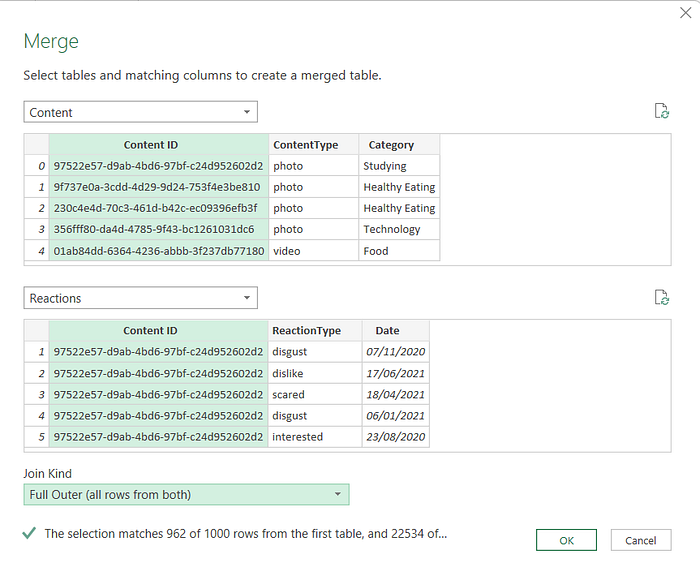
The exhibit above shows the first two tables I merged together, which were the Content and Reactions Table.
Using the Content ID field in both tables, I was able to merge both tables using the Full Outer Join Option, this join option enabled me to retain all rows from both tables.
To complete the merge process, I went ahead to merge the output from the initially merged tables (Content and Reactions table), with the ReactionTypes table, using the ReactionType column as the common field.

The exhibit below shows the final output of the merge process, a single table that contains all the columns from the three datasets I started out with.

Analyzing and Visualizing Data
Analyzing data and visualizing the findings in an insightful way wasthe next stage of the data analytics project for Social Buzz.
I was able to analyze the data in line with the stated business questions. I also discovered more insights that were beyond the scope of Social Buzz’s requirements and decided to identify them as well.
Here are my findings:
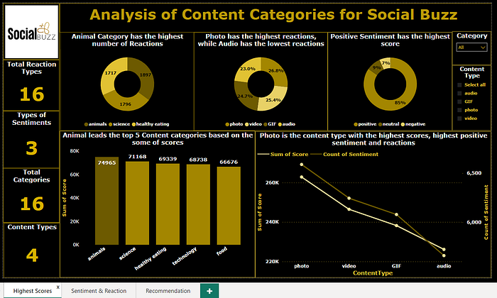
- The top 5 most rated categories are Animals, Science, Healthy eating, Technology, and food. The some of scores for all 5 categories are shown in the chart below.

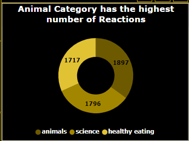
So, Animal Category has the highest total scores of 74,965 as shown in the column chart above, the highest number of reactions of 1,897 as shown in the doughnut chart below, and the highest of both positive and negative sentiments as well.
2. There are 16 unique categories, 16 unique Reaction types, 3 distinct types of sentiment, and 4 unique types of contents as revealed by the data.

3. May was the month with the highest number of posts totaling 2138. The second largest posts were made in January with a count of 2126.
It is evident that the number of contents posted experienced a dip after every rise, with the lowest dip in February having a some of 1914 posts.

4. 85% of the total sentiments on the posts were positive while 9% were neutral and 7% were negative sentiments.

5. Photo is the best-rated content type with the highest positive reactions of 3700, highest sentiments of 6589, and overall highest score of 262,838.


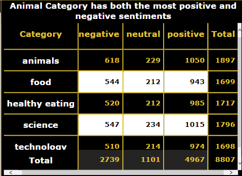
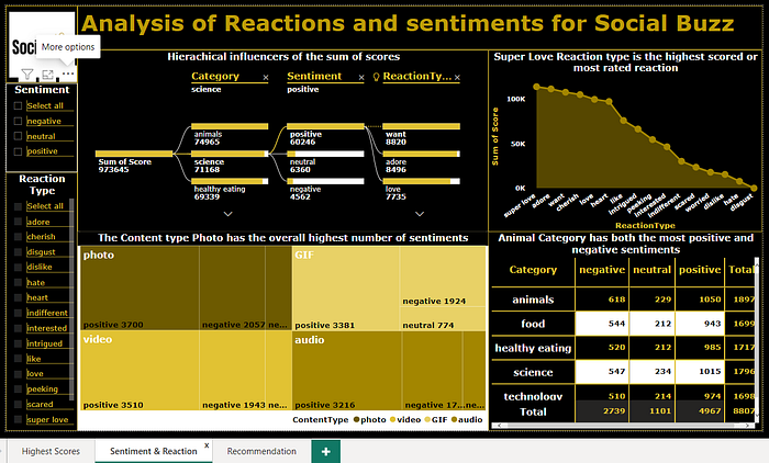
6. Science Category recorded the highest neutral, and the second highest positive and negative reactions. As indicated earlier, Animal category has both the highest negative and the highest positive sentiments. Thus, becoming the category with the overall highest count of sentiments as seen in the table below.
7. The highest scored or the most-rated reaction type is “superlove”, with a total score of 113,925. Superlove is a positive sentiment. It is also worthy of note that the top 10 sentiments by the total score are all positive sentiments which include adore, want, cherish, and love amongst others.

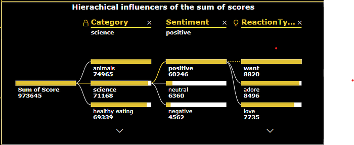
8. The best influencers of the sum of scores are the content categories, sentiment and reactions in that hierarchical order.
Final Dashboards:
I compiled the final dashboard in the pages shown below
Recommendations
1. Since Social Buzz has more positive reactions and sentiments of 85%, it means that they are already doing a great job. Thus, they need to rinse, repeat and improve on some of their strategies to sustain growth for the long run.
2. Posts around animals, science, healthy eating, food, and technology should be prioritized as featured posts because they are the top 5 rated categories.
3. Social Buzz should minimize its audio content while increasing its photos and video content, which are the most loved and rated content types.
4. Having both healthy eating and food in the top 5 content categories goes a long way to show how people are conscious of their health and nutrition. Therefore, more nutritional content should be shared, along with food recipes that may be blogged by Social Buzz.
5. Social Buzz should maintain a high level of consistency and accuracy in posting technology content as it is the 4th best-rated category and the quest for technology awareness is growing with the rapid growth in the industry.
6. Social Buzz should investigate the reason behind the fluctuating number of posts across the months. This will enable them to optimize the most active months when they can post their best content.

